

Building a modern Shopify product template with variant tabs and a specification accordion
How to ship a premium product page in Shopify — variant tabs instead of dropdowns, a clean spec accordion, and the Liquid + CSS + JS split that keeps it maintainable.
Most Shopify product pages still ship with a size dropdown and a wall of unstructured copy. That worked in 2015. In 2026, the brands that convert — Apple, Tesla, Herman Miller, the better Shopify themes — have moved to variant tabs and a tight specification accordion. This post is the architecture I use when I build one of those product pages on Shopify, end-to-end: Liquid, CSS, JavaScript, and the file structure that keeps it maintainable.
The architecture in one picture
Before any code, the structure matters. Liquid handles data, CSS handles design, JavaScript handles interaction. The single biggest mistake on beginner themes is one enormous Liquid file that does all three. Professional themes split responsibilities into three folders:
- main-product.liquid
- product-gallery.liquid
- variant-tabs.liquid
- product-accordion.liquid
- product-template.css
- product-template.js
1. The section — main-product.liquid
The section file is the page composition. It loads its own assets, renders the snippets, and exposes a {% schema %} so merchants can add blocks from the theme editor. Note the use of {% form 'product' %}— that's the Shopify-native way to submit add-to-cart, and it preserves analytics, line item properties and selling-plan support out of the box.
{{ 'product-template.css' | asset_url | stylesheet_tag }}
<script src="{{ 'product-template.js' | asset_url }}" defer></script>

<section class="modern-product-page" data-section-id="{{ section.id }}">
  <div class="product-container page-width">

    {% render 'product-gallery', product: product %}

    <div class="product-info-wrapper">
      <nav class="breadcrumb" aria-label="Breadcrumb">
        <a href="{{ routes.root_url }}">Home</a> /
        <a href="{{ product.type | url_for_type }}">{{ product.type }}</a> /
        <span>{{ product.title }}</span>
      </nav>

      <h1 class="product-title">{{ product.title }}</h1>

      <p class="product-price" id="ProductPrice">
        {{ product.selected_or_first_available_variant.price | money }}
      </p>

      {% render 'variant-tabs', product: product %}
      {% render 'product-accordion', product: product %}

      {% form 'product', product, id: 'AddToCartForm' %}
        <input type="hidden" name="id" id="VariantIdInput"
               value="{{ product.selected_or_first_available_variant.id }}">

        <div class="product-actions">
          <button type="submit" class="add-to-cart-button"
                  {% unless product.available %}disabled{% endunless %}>
            {% if product.available %}Add to Cart{% else %}Sold out{% endif %}
          </button>
          <button type="button" class="buy-now-button">Buy it now</button>
        </div>
      {% endform %}
    </div>
  </div>
</section>

{% schema %}
{
  "name": "Modern product",
  "settings": [],
  "presets": [{ "name": "Modern product" }]
}
{% endschema %}
2. The snippet — variant tabs
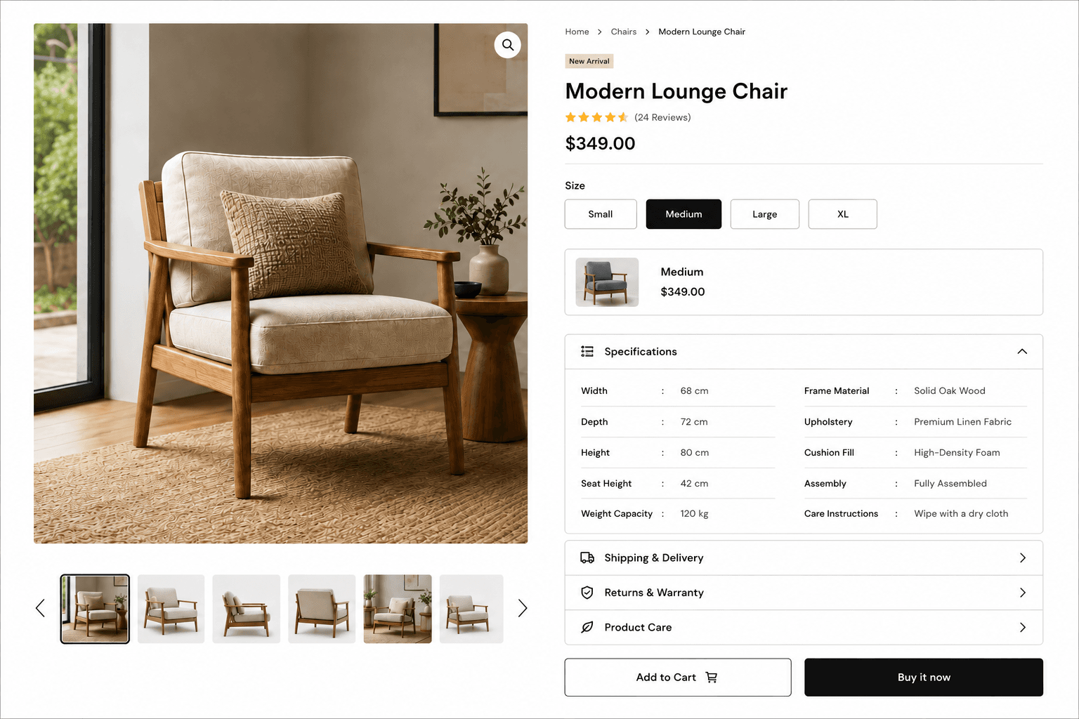
Variants live on product.variants. Each one has id, title, price, available and (when set) image. Looping over them gives you a tab per variant. The two things most tutorials skip: aria-selected on the active tab, and aria-disabled on sold-out variants. Both are non-negotiable for accessibility and Shopify checkout assistive tech.
<div class="variant-tabs-wrapper">
  <p class="variant-label">{{ product.options.first }}</p>

  <div class="variant-tabs" role="tablist">
    {% for variant in product.variants %}
      <button
        type="button"
        role="tab"
        class="variant-tab {% if variant == product.selected_or_first_available_variant %}is-active{% endif %}"
        data-variant-id="{{ variant.id }}"
        data-price="{{ variant.price | money }}"
        data-available="{{ variant.available }}"
        aria-selected="{% if variant == product.selected_or_first_available_variant %}true{% else %}false{% endif %}"
        {% unless variant.available %}aria-disabled="true"{% endunless %}
      >
        {{ variant.title }}
      </button>
    {% endfor %}
  </div>
</div>
Styling the tabs
Use CSS variables tied to the theme's tokens so the tabs follow brand colours automatically when the merchant changes them. Keep the active state a flat inverted swatch — busy gradients age badly.
.variant-tabs {
  display: flex;
  flex-wrap: wrap;
  gap: 12px;
}

.variant-tab {
  min-width: 110px;
  height: 48px;
  padding: 0 18px;
  background: var(--color-surface);
  color: var(--color-text);
  border: 1px solid var(--color-line);
  border-radius: 10px;
  font-size: 15px;
  cursor: pointer;
  transition: background 200ms ease, color 200ms ease, border-color 200ms ease;
}

.variant-tab:hover {
  border-color: var(--color-text);
}

.variant-tab.is-active {
  background: var(--color-text);
  color: var(--color-surface);
  border-color: var(--color-text);
}

.variant-tab[aria-disabled="true"] {
  opacity: 0.4;
  cursor: not-allowed;
  text-decoration: line-through;
}
Wiring the tabs to the form
Click a tab, switch the hidden id input, update the visible price, and sync the URL so refreshing or sharing the link preserves the chosen variant. That last step is what most themes forget — and it's the difference between a polished store and a fragile one.
// assets/product-template.js
const tabs = document.querySelectorAll('.variant-tab');
const priceEl = document.getElementById('ProductPrice');
const variantInput = document.getElementById('VariantIdInput');

tabs.forEach((tab) => {
  tab.addEventListener('click', () => {
    if (tab.getAttribute('aria-disabled') === 'true') return;

    tabs.forEach((t) => {
      t.classList.remove('is-active');
      t.setAttribute('aria-selected', 'false');
    });

    tab.classList.add('is-active');
    tab.setAttribute('aria-selected', 'true');

    variantInput.value = tab.dataset.variantId;
    priceEl.textContent = tab.dataset.price;

    // keep the URL in sync so refresh/share preserves the choice
    const url = new URL(window.location.href);
    url.searchParams.set('variant', tab.dataset.variantId);
    window.history.replaceState({}, '', url);
  });
});3. The snippet — specification accordion
Specifications, shipping and warranty are perfect accordion content: useful to a buyer ready to convert, noise to a browser scanning above the fold. Use the native <details> / <summary> elements — they're keyboard-accessible by default and don't need a single line of JavaScript to expand and collapse. Drive the spec rows from a Shopify metafield so merchants can edit them without touching code.
<div class="product-accordions">
  {% for block in section.blocks %}
    <details class="accordion-item" {% if forloop.first %}open{% endif %}>
      <summary class="accordion-header">
        <span>{{ block.settings.title }}</span>
        <span class="accordion-icon" aria-hidden="true">+</span>
      </summary>

      <div class="accordion-content">
        {% if block.type == 'specifications' %}
          <dl class="specification-grid">
            {% for spec in product.metafields.specs.rows.value %}
              <div class="specification-row">
                <dt>{{ spec.label }}</dt>
                <dd>{{ spec.value }}</dd>
              </div>
            {% endfor %}
          </dl>
        {% else %}
          {{ block.settings.content }}
        {% endif %}
      </div>
    </details>
  {% endfor %}
</div>
Tabs vs. dropdowns — why this matters
The dropdown is the default because it's easy to ship, not because it converts. Tabs give buyers all options at a glance, larger tap targets, and a single click to switch — fewer steps before add-to-cart.
| Criterion | Dropdown (legacy) | Variant tabs (modern) |
|---|---|---|
| Discovery | Hidden — buyer must open the select | All options visible at a glance |
| Tap target | Small, varies by OS | Large, consistent across devices |
| Sold-out signal | Awkward — needs disabled options | Strikethrough tab reads instantly |
| Clicks to switch | Two (open, choose) | One |
| Brand feel | Generic, form-like | Premium, controlled, on-brand |
The accordion checklist
Use accordions for content that's useful but not urgent:
- Specifications and materials
- Shipping and delivery windows
- Returns and warranty policy
- Care instructions
- Size guide
- Product-specific FAQ
Open the most-requested block by default — usually specifications — so a buyer doesn't have to click before they get value.
Next-level upgrades, once the base ships
- Variant image switching — listen for the tab click and swap
main-product-imagewhen the matching variant has an image set. - Sticky add-to-cart on mobile — a thin bar that appears after the hero scrolls past, holding the price and the CTA.
- Shopify Metaobjects for richer spec content (icons, links, grouped categories).
- Color swatches rendered from
variant.metafields.colour.hexinstead of text tabs. - Swiper / Embla for the gallery on mobile, with full keyboard and screen-reader support.
What to take away
A modern Shopify product page isn't a CSS trick — it's a discipline. Sections compose the page, snippets keep markup reusable, and assets carry styling and interaction. Variant tabs replace the dropdown. Native <details> drives the accordion. Metafields drive the spec content. Get that foundation right and every product on the store — current and future — inherits a premium product page for free.
Migrating WooCommerce to Shopify without losing SEO or conversions
The process I use to replatform a store from WooCommerce to Shopify — redirect mapping, data migration and the conversion work — the way I ran it for Stateside Distribution for a 20% conversion lift.
Blocking fraudulent orders with Shopify Flow
How I built a native Shopify Flow automation to catch high-risk and mismatched-address orders the moment they're placed — tag, hold fulfillment and review before anything ships.
Shopify CLI, GitHub and CI/CD — a professional theme workflow
How I run Shopify theme work in 2026 — Shopify CLI for local dev, GitHub for version control, and GitHub Actions for safe, automated deploys to live and staging themes.